![]()

![]()
Leverages dplyr to process the calculations of a plot inside a database. This package provides helper functions that abstract the work at three levels:
- Functions that output a
ggplot2object - Functions that output a
data.frameobject with the calculations - Functions that create formulas for calculating bins for a Histogram or a Raster plot
Installation
You can install the released version from CRAN:
install.packages("dbplot")Or the development version from GitHub, using the remotes package:
install.packages("remotes")
pak::pak("edgararuiz/dbplot")
Connecting to a data source
For more information on how to connect to databases, including Hive, please visit https://solutions.posit.co/connections/db/
To use Spark, please visit the
sparklyrofficial website: https://spark.posit.co
Example
The functions work with standard database connections (via DBI/dbplyr) and with Spark connections (via sparklyr). A local DuckDB database will be used for the examples in this README.
ggplot
Histogram
By default dbplot_histogram() creates a 30 bin histogram
library(ggplot2)

db_flights |>
  dbplot_histogram(distance)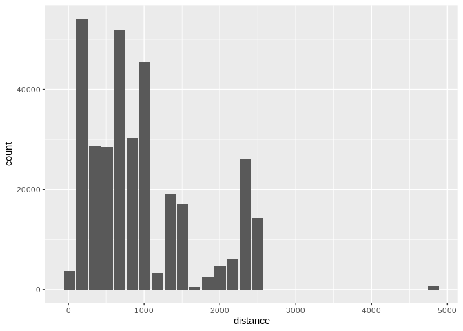
Histogram of flight distances with default 30 bins
Use binwidth to fix the bin size
db_flights |>
  dbplot_histogram(distance, binwidth = 400)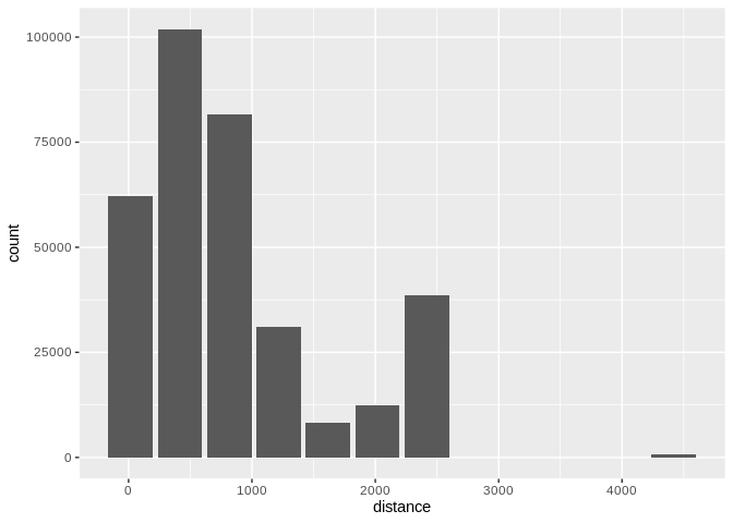
Histogram of flight distances with 400-unit bins
Because it outputs a ggplot2 object, more customization can be done
db_flights |>
  dbplot_histogram(distance, binwidth = 400) +
  labs(title = "Flights - Distance traveled") +
  theme_bw()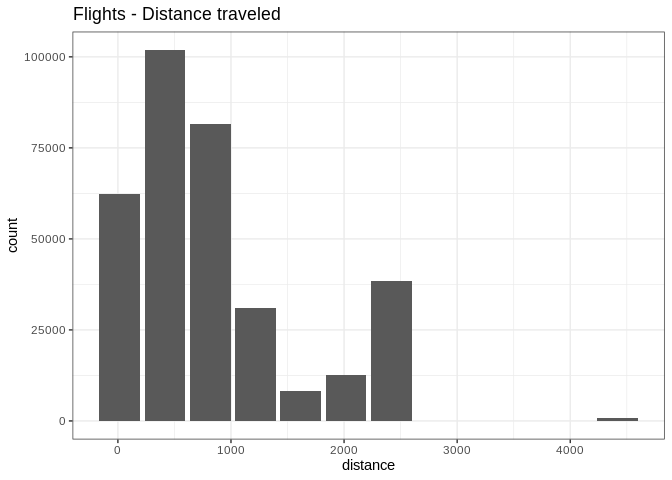
Customized histogram with title and theme
Raster
To visualize two continuous variables, we typically resort to a Scatter plot. However, this may not be practical when visualizing millions or billions of dots representing the intersections of the two variables. A Raster plot may be a better option, because it concentrates the intersections into squares that are easier to parse visually.
A Raster plot basically does the same as a Histogram. It takes two continuous variables and creates discrete 2-dimensional bins represented as squares in the plot. It then determines either the number of rows inside each square or processes some aggregation, like an average.
- If no
fillargument is passed, the default calculation will be count,n()
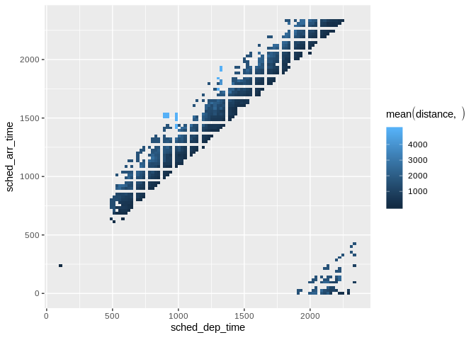
db_flights |>
  dbplot_raster(sched_dep_time, sched_arr_time)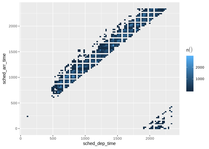
Raster plot of scheduled departure and arrival times
- Pass an aggregation formula that can run inside the database
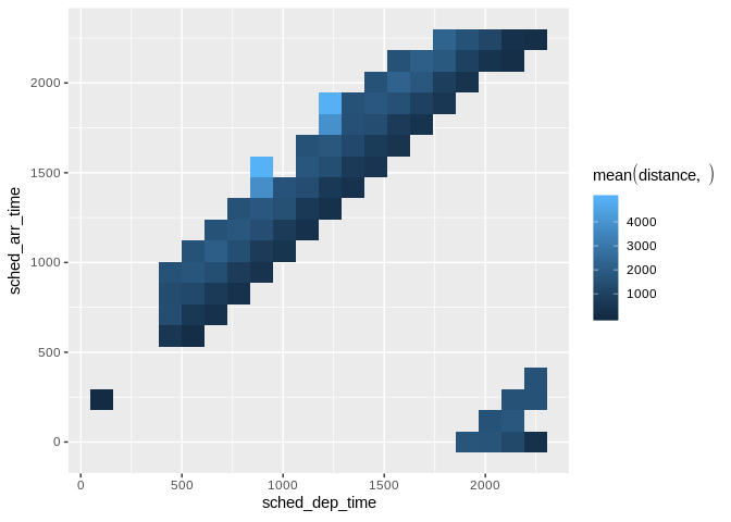
db_flights |>
  dbplot_raster(
    sched_dep_time,
    sched_arr_time,
    mean(distance, na.rm = TRUE)
    )
Raster plot showing average flight distance by time
- Increase or decrease for more, or less, definition. The
resolutionargument controls that, it defaults to 100
db_flights |>
  dbplot_raster(
    sched_dep_time,
    sched_arr_time,
    mean(distance, na.rm = TRUE),
    resolution = 20
    )
Raster plot with lower resolution (20x20 grid)
Bar Plot
-
dbplot_bar()defaults to a count() of each value in a discrete variable
db_flights |>
  dbplot_bar(origin)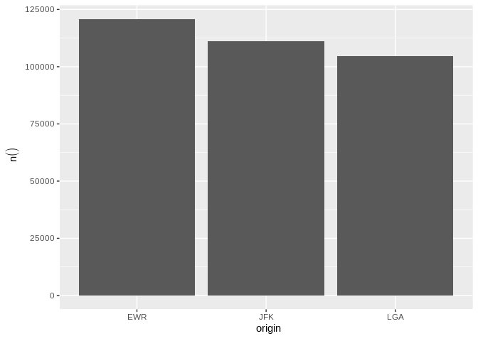
Bar plot of flight counts by origin airport
- Pass an aggregation formula that will be calculated for each value in the discrete variable
db_flights |>
  dbplot_bar(origin, avg_delay =  mean(dep_delay, na.rm = TRUE))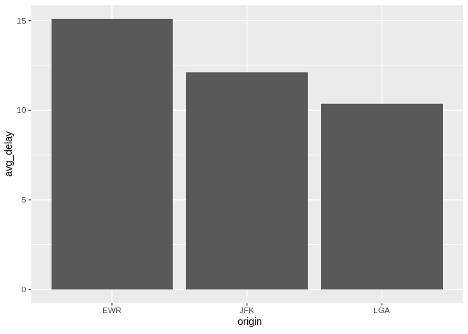
Bar plot of average departure delay by origin airport
Line plot
-
dbplot_line()defaults to a count() of each value in a discrete variable
db_flights |>
  dbplot_line(month)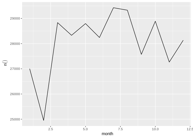
Line plot of flight counts by month
- Pass a formula that will be operated for each value in the discrete variable
db_flights |>
  dbplot_line(month, avg_delay = mean(dep_delay, na.rm = TRUE))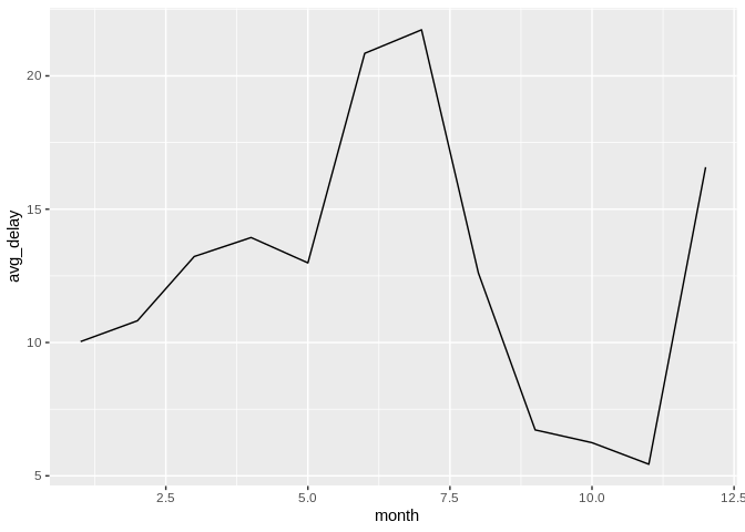
Line plot of average departure delay by month
Boxplot
It expects a discrete variable to group by, and a continuous variable to calculate the percentiles and IQR. It doesn’t calculate outliers.
Boxplot functions require database support for percentile/quantile calculations.
Supported databases:
- DuckDB (recommended for local examples) - uses
quantile() - Spark/Hive (via sparklyr) - uses
percentile_approx() - SQL Server (2012+) - uses
PERCENTILE_CONT() - PostgreSQL (9.4+) - uses
percentile_cont() - Oracle (9i+) - uses
PERCENTILE_CONT()
Not supported: SQLite, MySQL < 8.0, MariaDB (no percentile functions)
Here is an example using dbplot_boxplot() with a local data frame:
nycflights13::flights |>
  dbplot_boxplot(origin, distance)
Boxplot of flight distances by origin airport (local data)
Boxplot also works with database connections that support quantile functions:
db_flights |>
  dbplot_boxplot(origin, distance)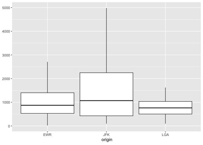
Boxplot of flight distances by origin airport (DuckDB)
Calculation functions
If a more customized plot is needed, the data the underpins the plots can also be accessed:
-
db_compute_bins()- Returns a data frame with the bins and count per bin -
db_compute_count()- Returns a data frame with the count per discrete value -
db_compute_raster()- Returns a data frame with the results per x/y intersection -
db_compute_raster2()- Returns same asdb_compute_raster()function plus the coordinates of the x/y boxes -
db_compute_boxplot()- Returns a data frame with boxplot calculations
db_flights |>
  db_compute_bins(arr_delay)
#> # A tibble: 28 × 2
#>    arr_delay  count
#>        <dbl>  <dbl>
#>  1      95.1   7890
#>  2     321.     232
#>  3     729.       5
#>  4     548.       6
#>  5     684.       1
#>  6     -40.7 207999
#>  7      NA     9430
#>  8     276.     425
#>  9     457.      23
#> 10     593        6
#> # ℹ 18 more rows
The data can be piped to a plot
db_flights |>
  filter(arr_delay < 100 , arr_delay > -50) |>
  db_compute_bins(arr_delay) |>
  ggplot() +
  geom_col(aes(arr_delay, count, fill = count))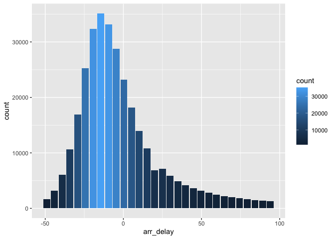
Custom histogram of arrival delays using db_compute_bins
db_bin()
Uses ‘rlang’ to build the formula needed to create the bins of a numeric variable in an un-evaluated fashion. This way, the formula can be then passed inside a dplyr verb.
db_bin(var)
#> (((max(var, na.rm = TRUE) - min(var, na.rm = TRUE))/30) * ifelse(as.integer(floor((var -
#>     min(var, na.rm = TRUE))/((max(var, na.rm = TRUE) - min(var,
#>     na.rm = TRUE))/30))) == 30, as.integer(floor((var - min(var,
#>     na.rm = TRUE))/((max(var, na.rm = TRUE) - min(var, na.rm = TRUE))/30))) -
#>     1, as.integer(floor((var - min(var, na.rm = TRUE))/((max(var,
#>     na.rm = TRUE) - min(var, na.rm = TRUE))/30))))) + min(var,
#>     na.rm = TRUE)
db_flights |>
  group_by(x = !! db_bin(arr_delay)) |>
  count()
#> # Source:   SQL [?? x 2]
#> # Database: DuckDB 1.4.4 [edgar@Darwin 25.3.0:R 4.5.2/:memory:]
#> # Groups:   x
#>         x      n
#>     <dbl>  <dbl>
#>  1 -40.7  207999
#>  2  NA      9430
#>  3 276.      425
#>  4 457.       23
#>  5 593         6
#>  6   4.53  79784
#>  7 186.     1742
#>  8  95.1    7890
#>  9 321.      232
#> 10 729.        5
#> # ℹ more rows
db_flights |>
  filter(!is.na(arr_delay)) |>
  group_by(x = !! db_bin(arr_delay)) |>
  count()|>
  collect() |>
  ggplot() +
  geom_col(aes(x, n))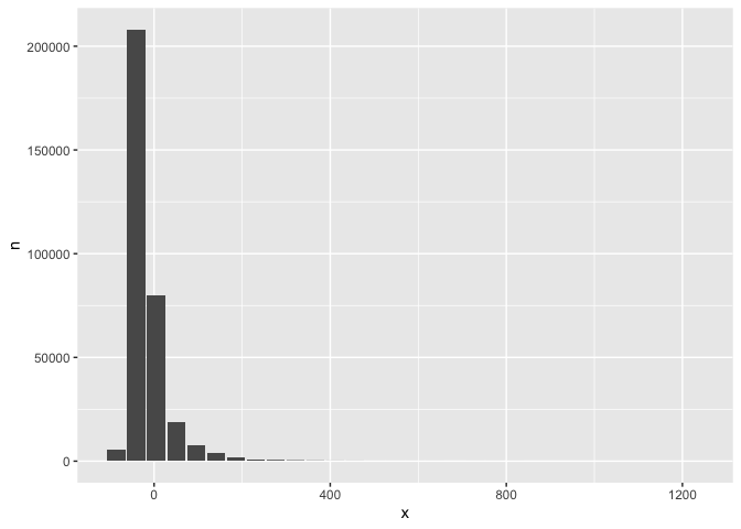
Custom histogram of arrival delays using db_bin
dbDisconnect(con)